Block: Blog Post Grid/Slider
From Posstack.com Documentation
Revision as of 05:08, 4 April 2025 by An (talk | contribs) (→Add a Blog Post grid on a dark background)
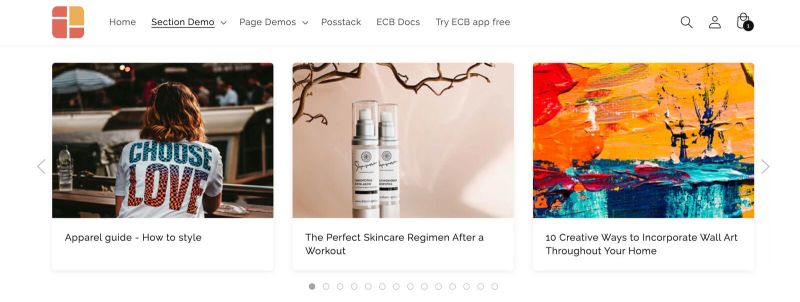
The Blog Post Grid/Slider section allows you to show:
- Articles: Show a list of articles from a specific blog or display all your articles.
- Random Articles: Present a mixed selection of articles pulled randomly from your blog.
- Related Info: For each blog post, you can include a featured image, the publication date, post tags, article excerpts, and a "Read more" button.
Blog Post grid/slider use cases
Article carousel, grid, and mansory layouts
See the article carousel, grid, and mansory layouts here
How to add Blog Post Grid/Slider section
- Step 1: Add a Section Settings section that allows you to control the global settings of the Blog Post Grid/Slider section.
- In this special section, you can specify multi-column layouts, activate full width, determine the section's maximum width, choose a background color, and set global margins and padding, among other options.
- Step 2: Add an Blog Post Grid/Slider section and customize the settings according to your preferences.

If you are new to our Easy Content Builder, please take a look at the Add Sections section for detailed instructions on how to add a section to your theme.
Blog Post Grid/Slider global settings
From the Shopify theme editor, click on Blog Post Grid/Slider on the sidebar to view the details of settings.
| Section settings | Description |
|---|---|
| Blog | Choose a specific blog, or leave this field blank to display all articles. |
| Limit items | The maximum number of articles that you can feature in the Blog Post Grid/Slider section. |
| Style | Select the Slider/Grid/Mansory layouts |
| Card Style | Create layout boxes for each product item. Emphasize an item with a primary card style. |
| Card Size | Decrease or increase the padding of the card body. |
| Box Shadow | Decrease or increase the box shadows of the card. |
| Round Border | Enable this setting to apply rounded corners. |
| Image Width (px) | Set the width (in pixel) of the article's featured image. |
| Image Height (px) | Set the height (in pixel) of the article's featured image. |
| Text Alignment | Align text to the left, right, or center. |
| Title Size | Change the heading to H1, H2, H3, H4, H5, or H6. |
| Show Description | Show or hide the article's excerpt |
| Description Length | Keep your descriptions long enough that they're sufficiently descriptive. The "optimal" length will vary depending on your specific situation. |
| Date | Show or hide the publication date. |
| Tags | Show or hide the article's tags |
| Read More button | Show or hide the Read More button |
| Item Width on Desktop | Define the Item width on desktop:
|
| Item Width on Mobile | Define the width of the article card.
|
| Gap | Set the gap between articles. |
| Show Slider Arrows | Show or hide the slider arrows on the Desktop. Place arrows inside or outside. |
| Show Navigation | Show or hide the dot navigation. |
| Slider Set | To loop through a set of slides instead of single article. |
| Animation On Scroll | It lets you apply different types of animation to elements within each section as you scroll down the page. Learn more about scrolling animations here. |
| Margin | Set the vertical spacing between elements. |
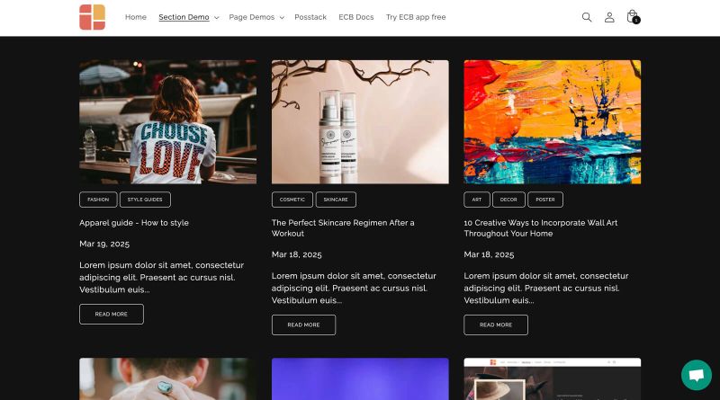
Add a Blog Post grid on a dark background
To display your blog posts on a dark background, follow these steps:
Step 1: Set up the Section Settings:
- Text Color: #ffffff (White)
- Background Color: #121212 (or any dark shade)
Feel free to adjust other settings as needed.
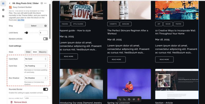
Step 2: Create a Blog Post Grid/Slider section with these settings:

- Card Style: No Card
- Card Size: No Padding
- Box Shadow: No Shadow
You can customize additional options as desired.
Add other content blocks
You can add many content blocks to a section you've created. These content blocks will be displayed in different positions within the section, depending on the Desktop/Mobile Layouts you configure.
See all content blocks available that you can add to a section.


